I. PROJECT OVERVIEW
Client/ Brand
WG US/ AccessDash
Teams
UX team – Director of Product, UX & Visual Design (that was me!) and UX Designer
Account Manager, Project Manager, Developer
Problem Statement, Client Goal and Objective
In order to check patient’s coverage before prescribing treatment, healthcare providers [HCPs] often rely on their professional experiences in conjunction with written and verbal communications from pharmaceutical representatives (e.g., formulary cards). In certain cases, a prescription is cost prohibitive for the patient or requires Prior Authorization [PA]. AccessDash will enable HCPs to check the relevant formulary information at the point of care and determine which medication will be most effective before deciding on a treatment plan.
AccessDash digitizes the formulary look-up process, includes a feature to print formulary cards, a link to the PARx pre-authorization service, and is designed for desktop and tablet viewing. Future phases will enable patients, payers and pharmaceutical marketers to use the platform.
In current practice, doctors prescribe medications to patients under the assumption that the medication is covered by the payer. This leads to patients potentially getting to a pharmacy and not being able to get their prescription filled.
One primary cause is that HCPs and their office staff do not have the most up-to-date formulary information. Pharmaceutical representatives communicate formulary information to HCPs either in person, over the telephone or via mail with printed formulary cards. However, formulary information changes frequently and there are often conditions that impact coverage for patients (e.g., prior authorization, step treatment, or quantity limits).
AccessDash addresses the breakdowns in the communications of medication coverage and authorization process by aggregating formulary data and providing HCPs and their staff access to this information. The ideal benefit is that HCPs and their staff will spend less time trying to find formulary information; patients would be less likely to experience coverage problems at the pharmacy.
Below illustrates an overview communication problem diagram.
Platform
Application will be compatible with the following:
II. DISCOVERY (DEFINING THE PROBLEM)
A. Understand the Problem
Who are the main users of the product?
1) HCPs
2) Pharmaceutical Employee
B. Understand the Users
In order to understand the users’ behaviors, we conducted interviews with 2 user types and summarized the results.
Assumptions
• Availability of a hardware/software platform
• Availability of data
• Future trends in formulary regulations
• Developments in technology
• Format of data will not change
• Going through government regulatory compliance
Constraints
• Data source for medications linked to conditions
• Government regulations (ISI Information) for search results outputs
• Rate limit determined by API (e.g., 100 requests per 60 minutes for formulary data source)
C. Understand the Competitor
There were no direct competitors. We researched an indirect competitor, Epocrates, application.
D. Understand the Client, Project Scope, Business Goals and KPIs
During our discovery phase, we realized that the client hadn't defined business goals and KPIs yet. We found it difficult to plan the product experience without these. So, we took the initiative to host a product strategy workshop with the client to identify the project scope, business goals and KPIs. We defined the long-term and short-term goals with client.
We also defined the specific success metrics (KPIs).
Then we did a 10 Second Gut Test to help us discover an initial visual design direction. We chose 6 screenshots for the clients to have varying reactions. Here is an example of one of the screens:
III. SOLUTIONS
A. Defining the Requirements
We agreed to a project scope that is agile and lean.
We identified the design process of phase 1.
We identified the feature requirements of phase 1.
B. User flow
C. Sitemap
After internal review and agreement, we presented a digitized sitemap.
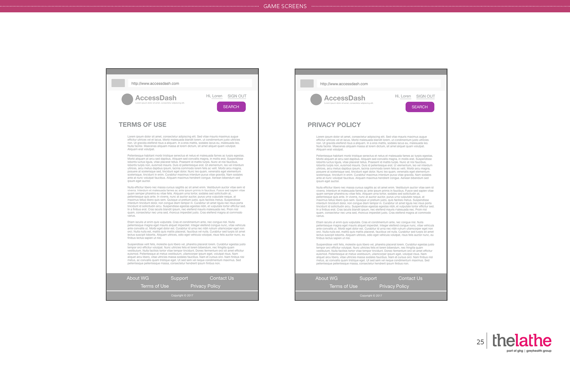
D. Wireframes
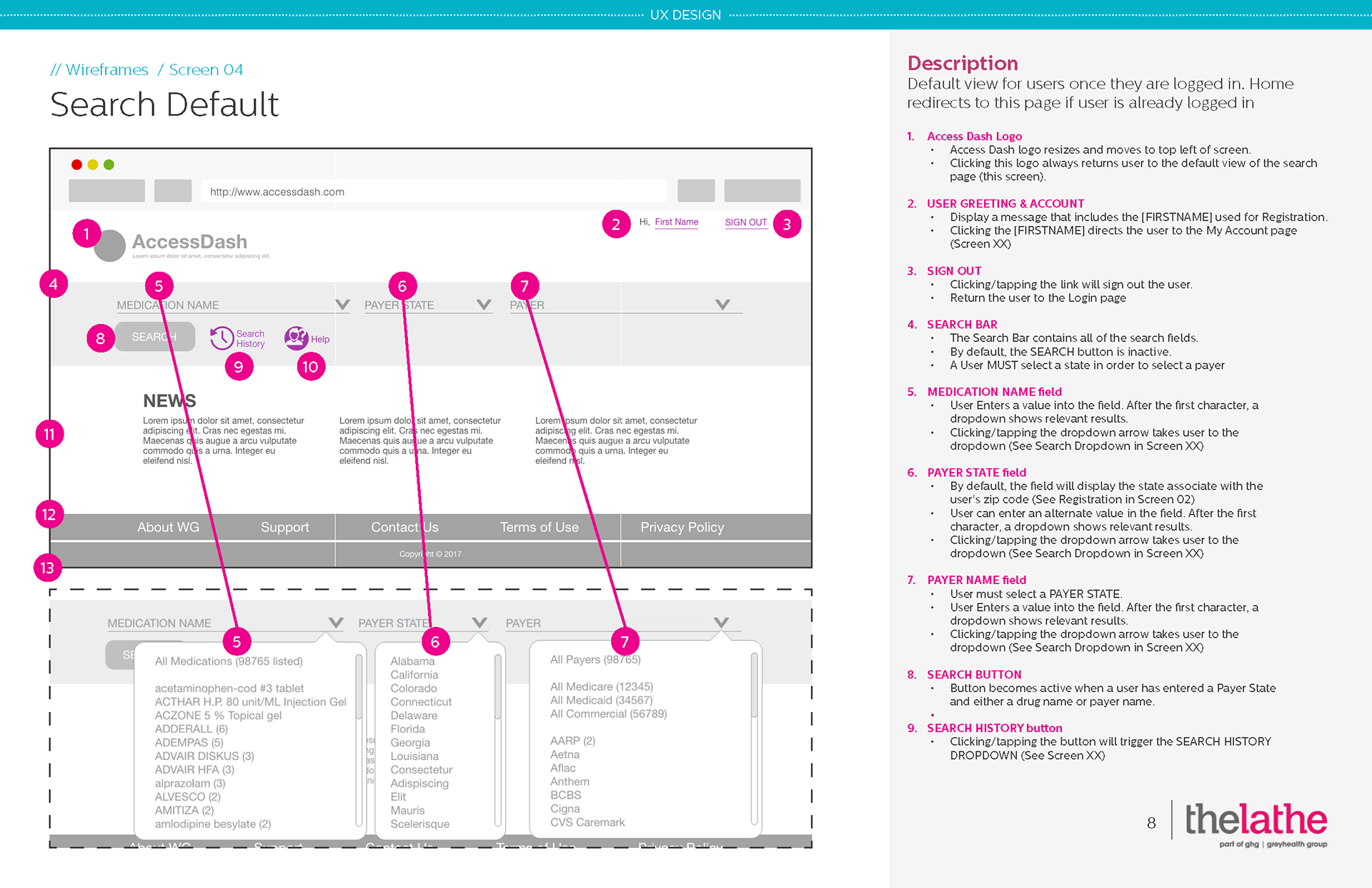
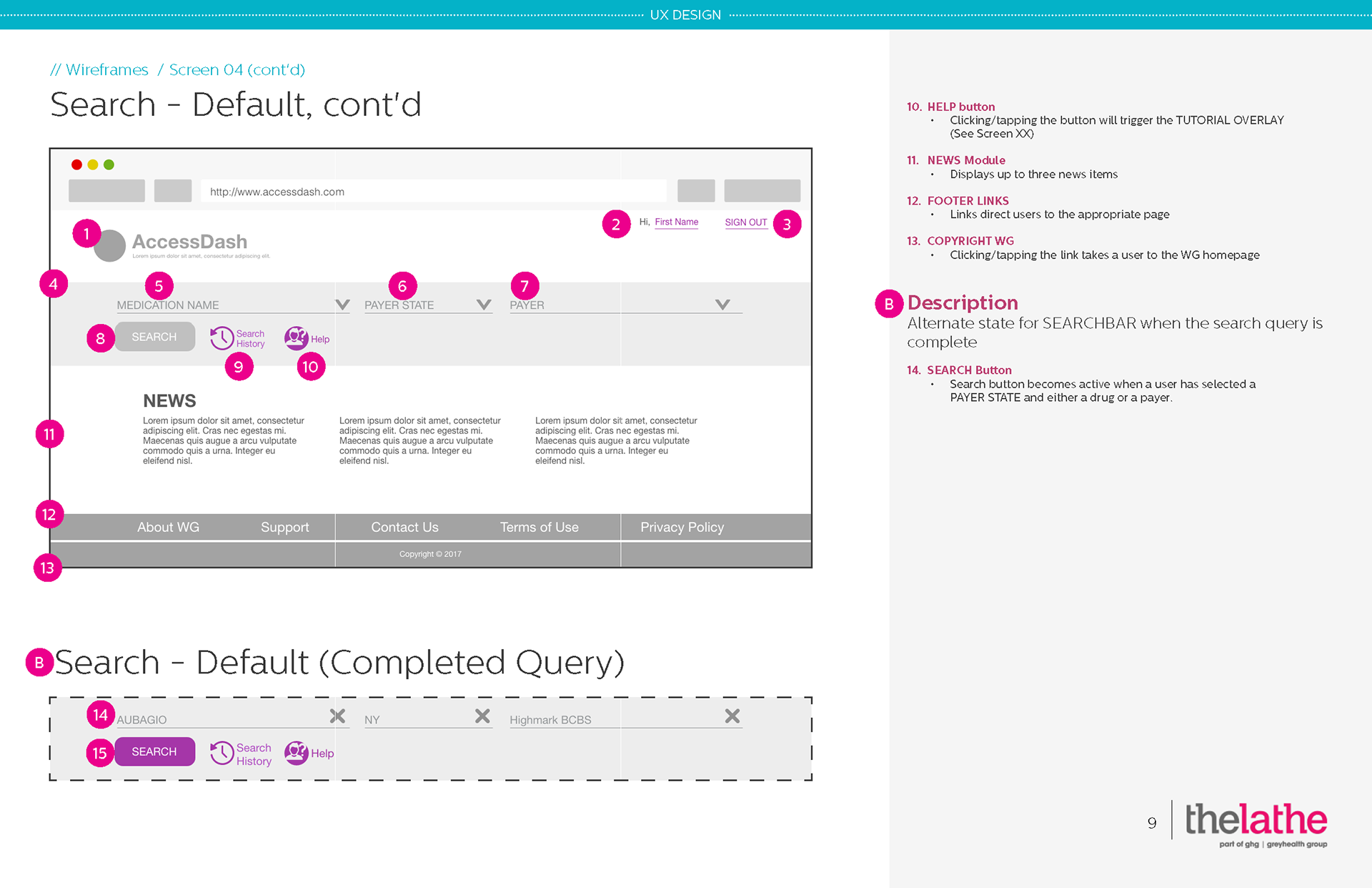
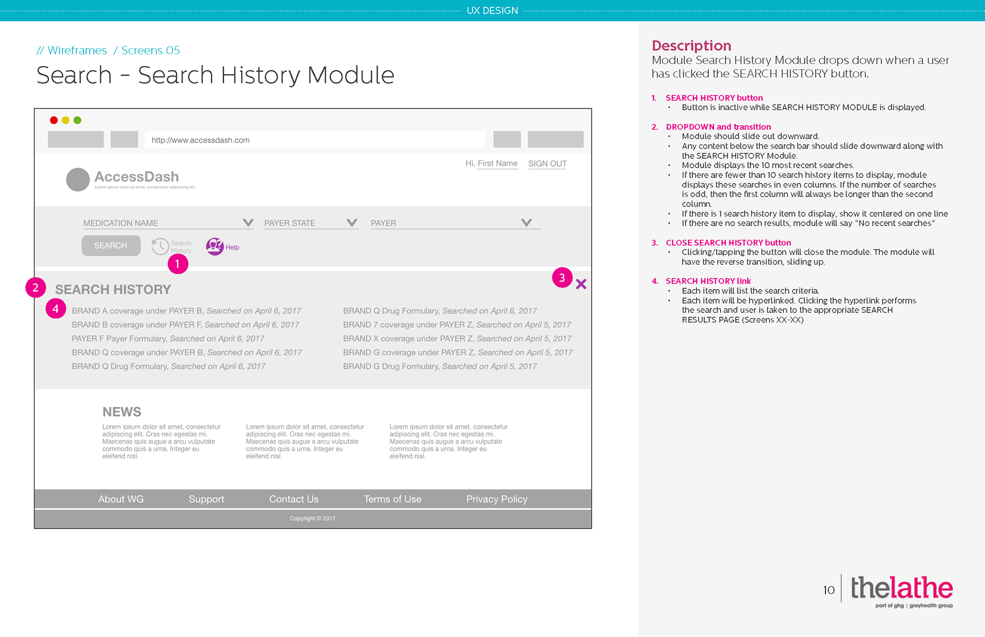
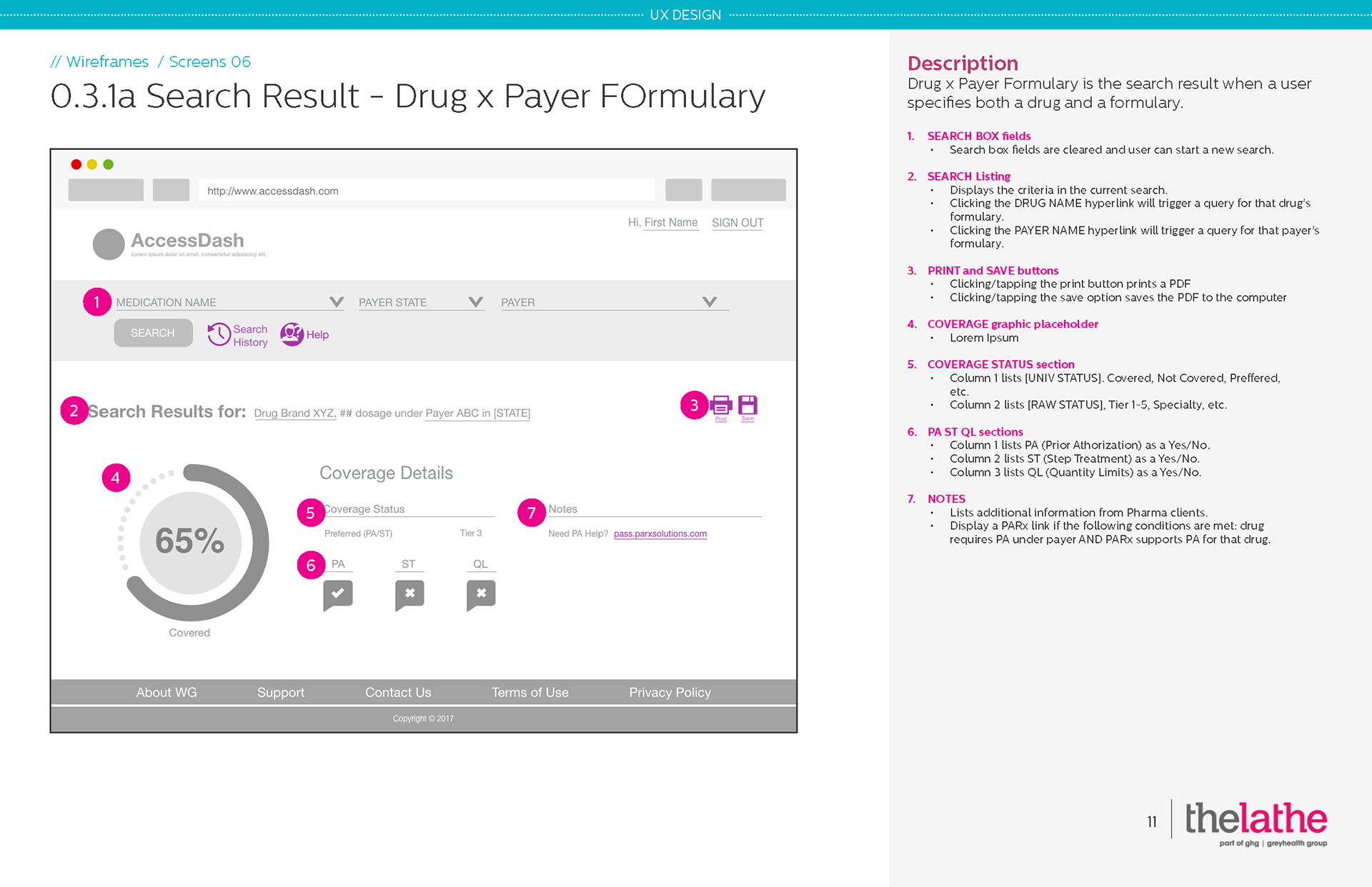
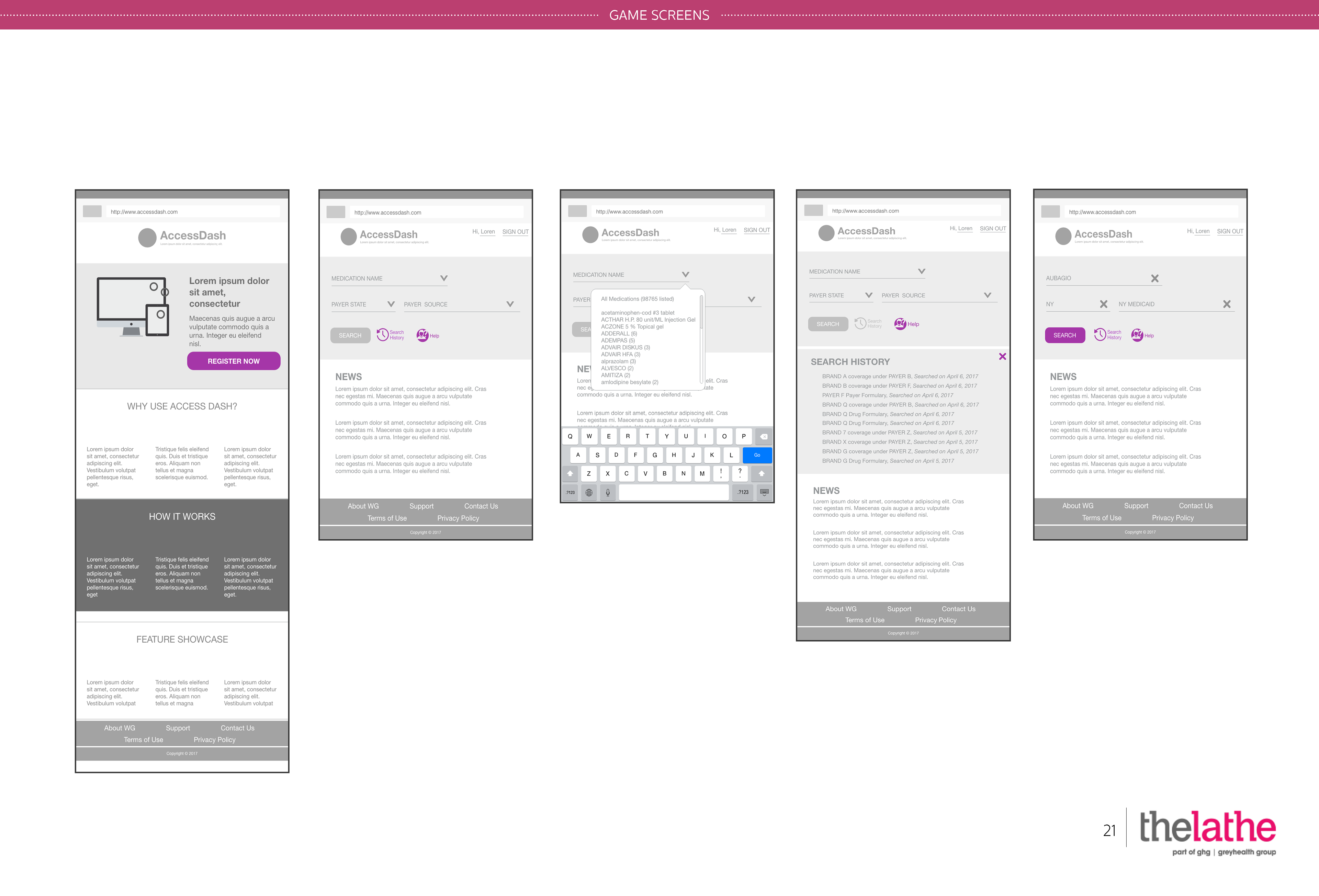
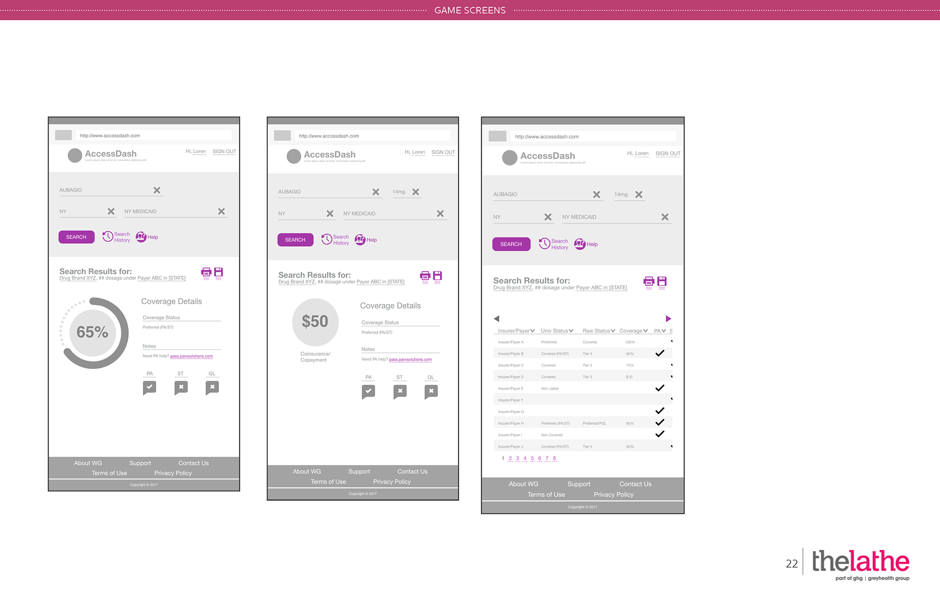
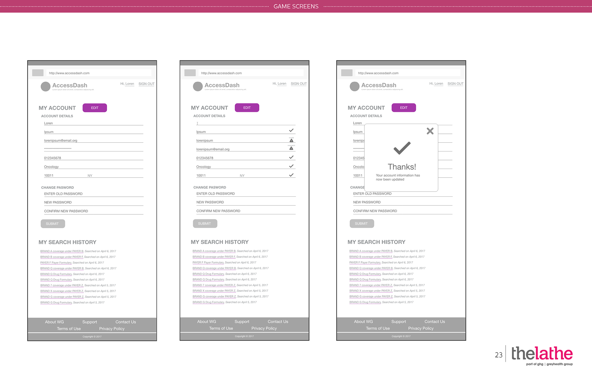
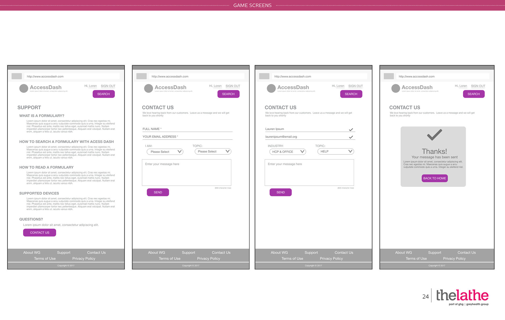
Using Sketch and PowerPoint, we drafted annotated wireframes.
Displayed below are desktop views.
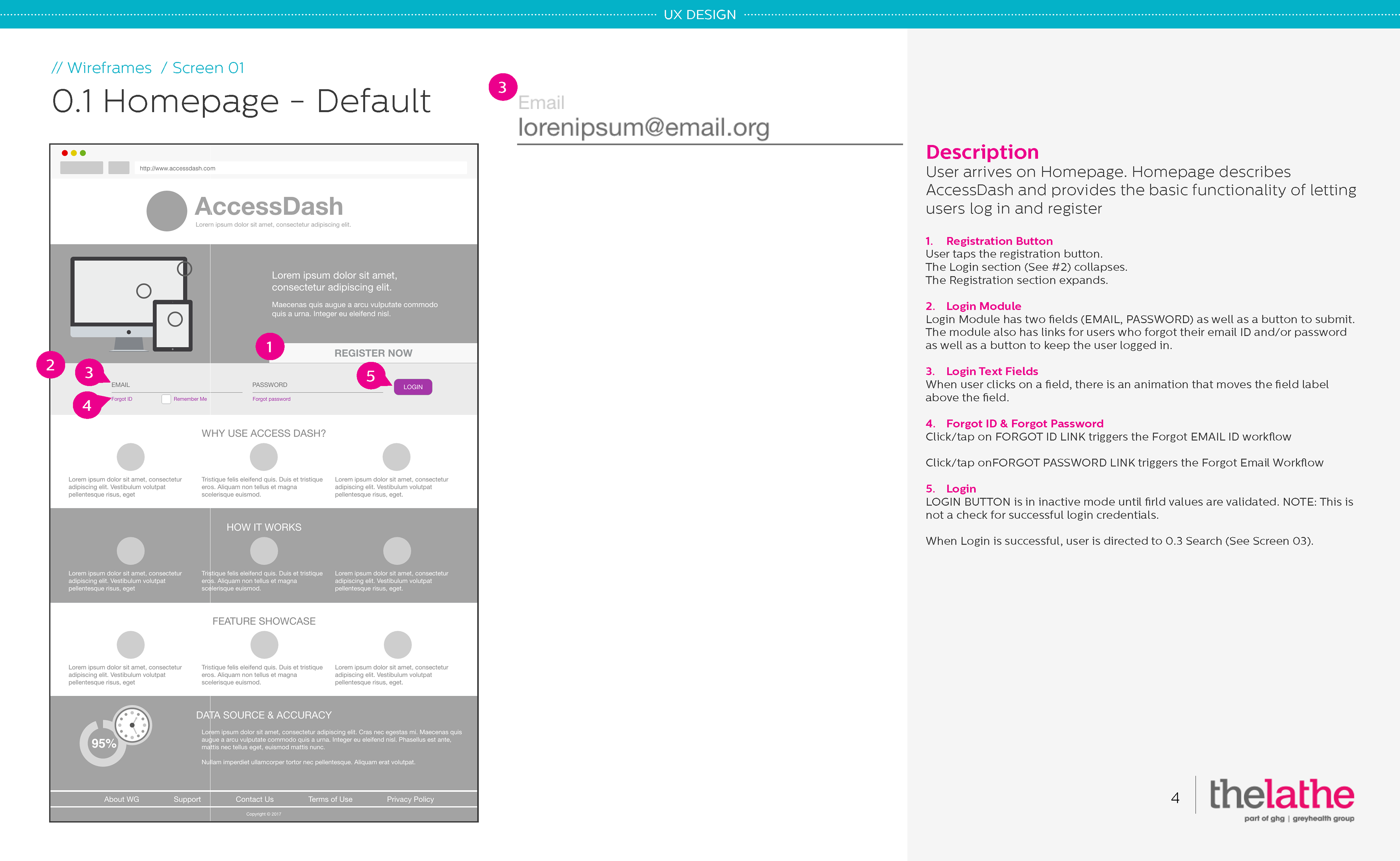
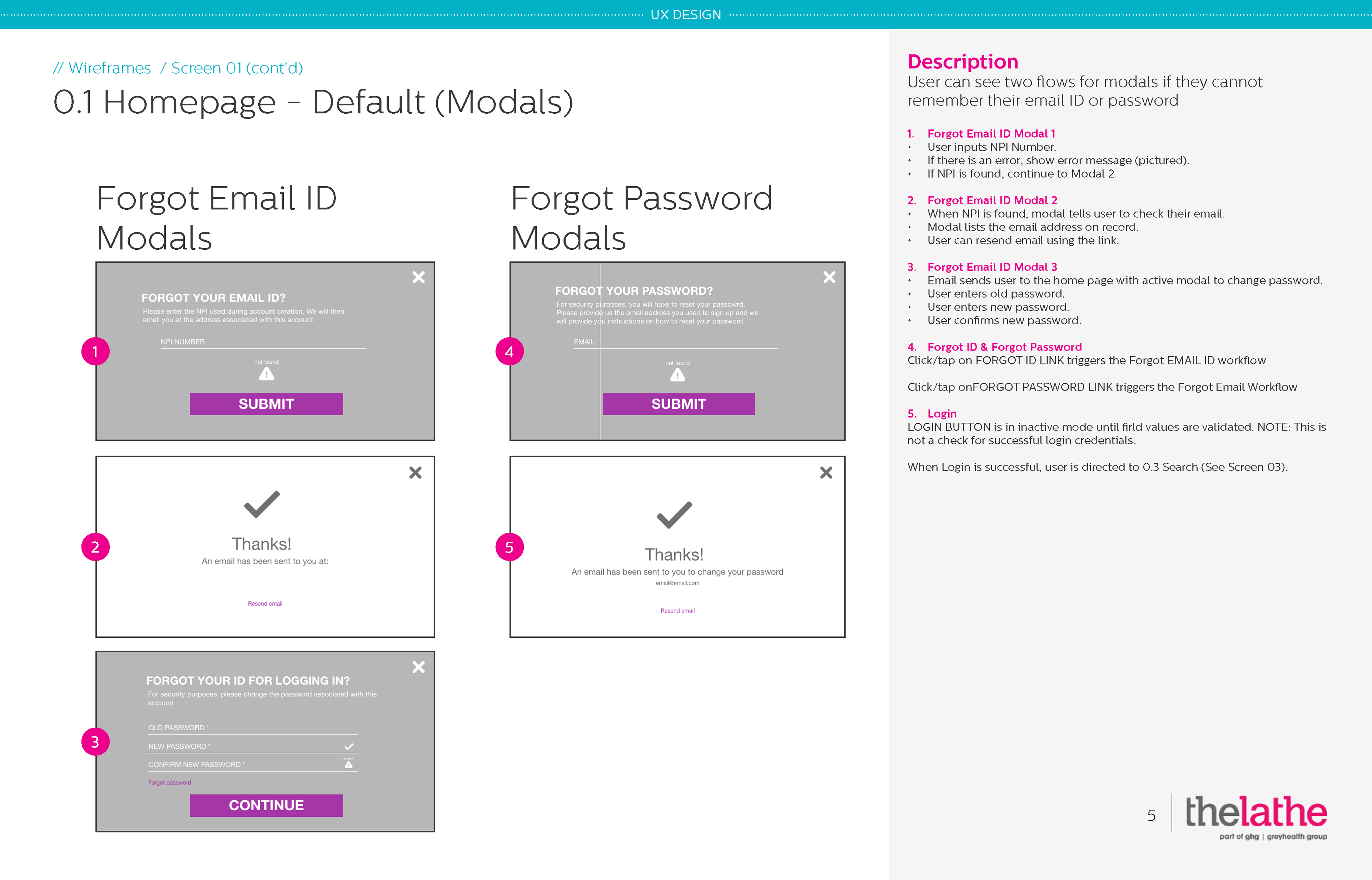
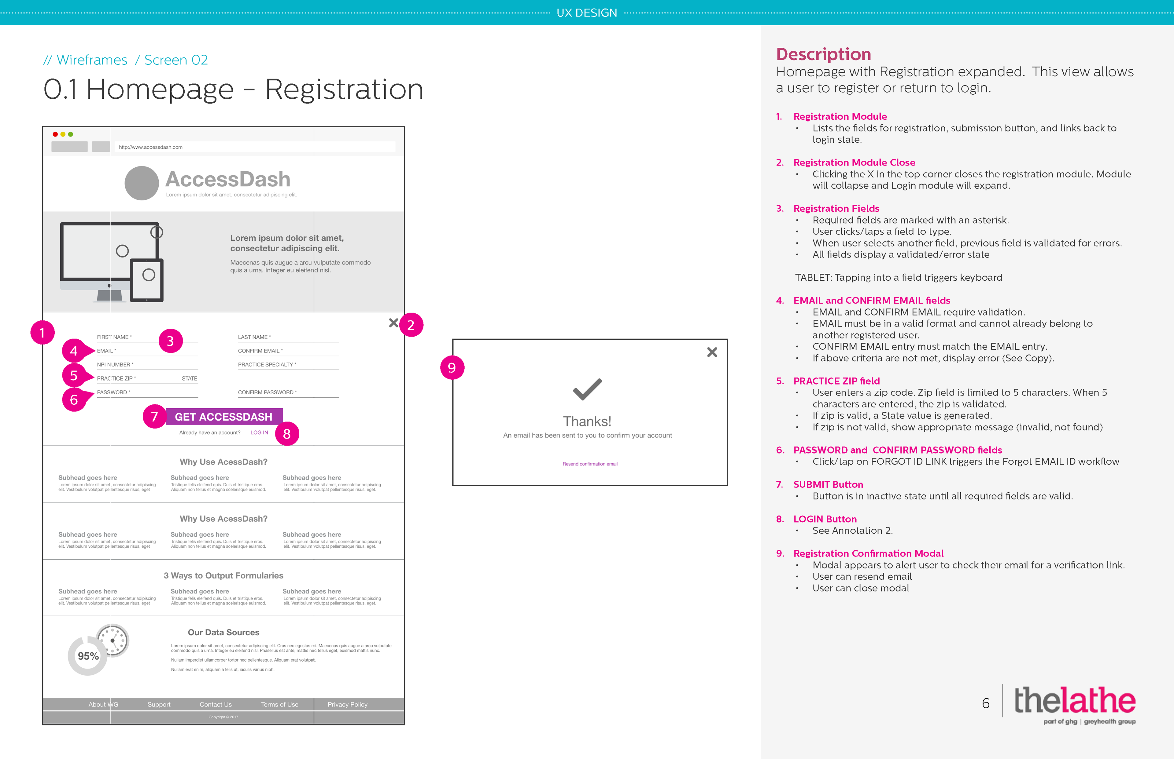
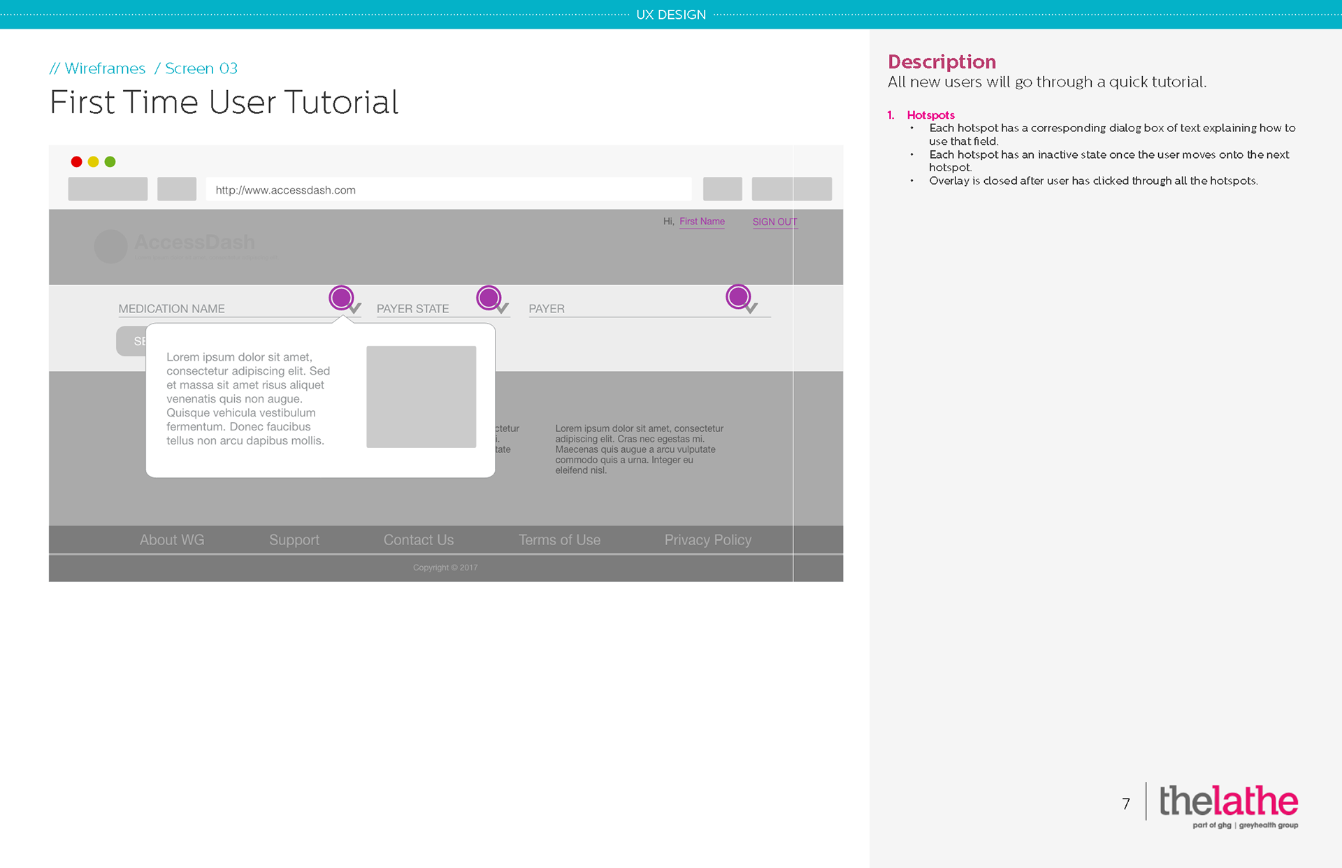
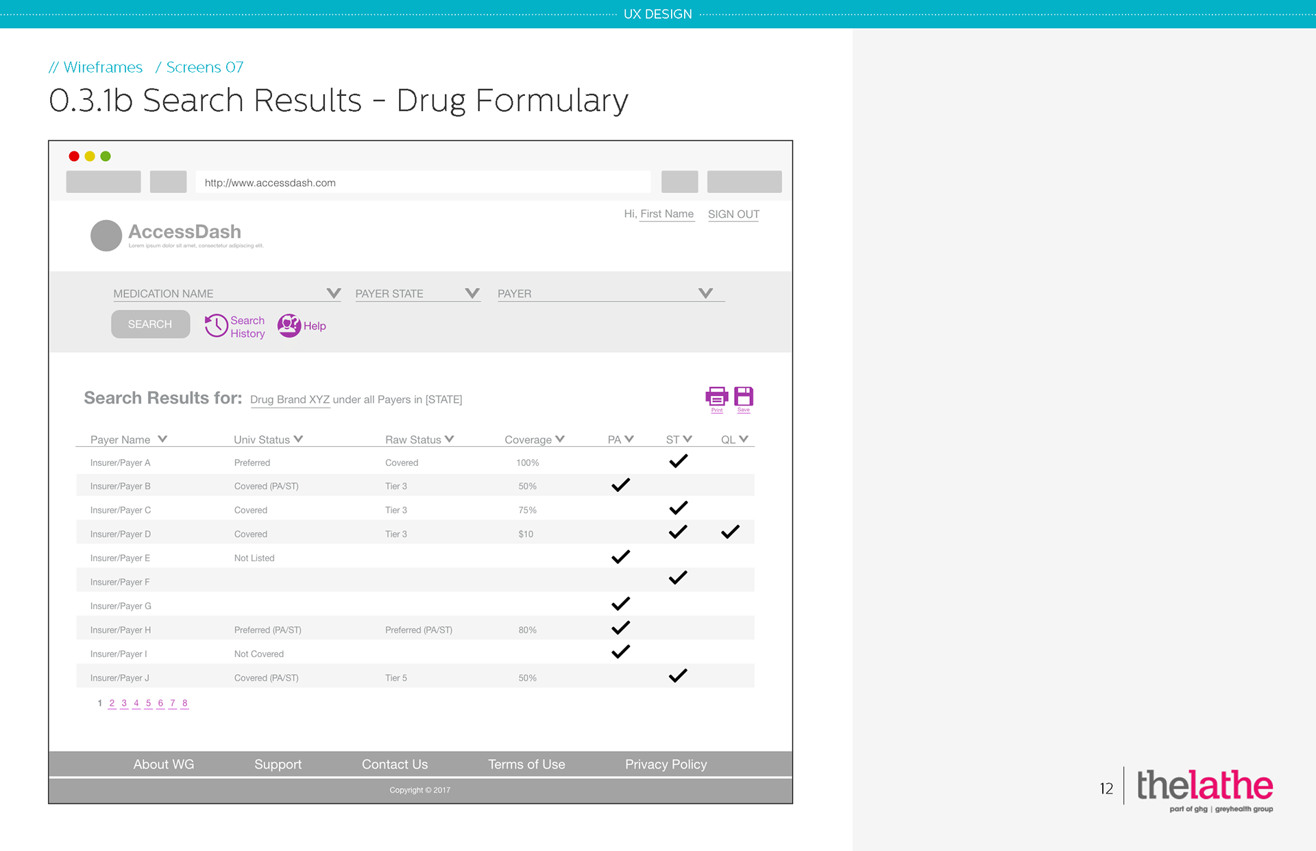
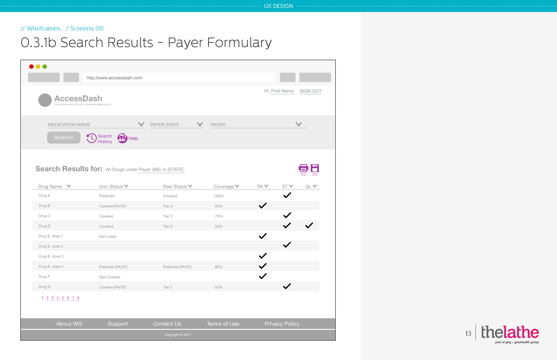
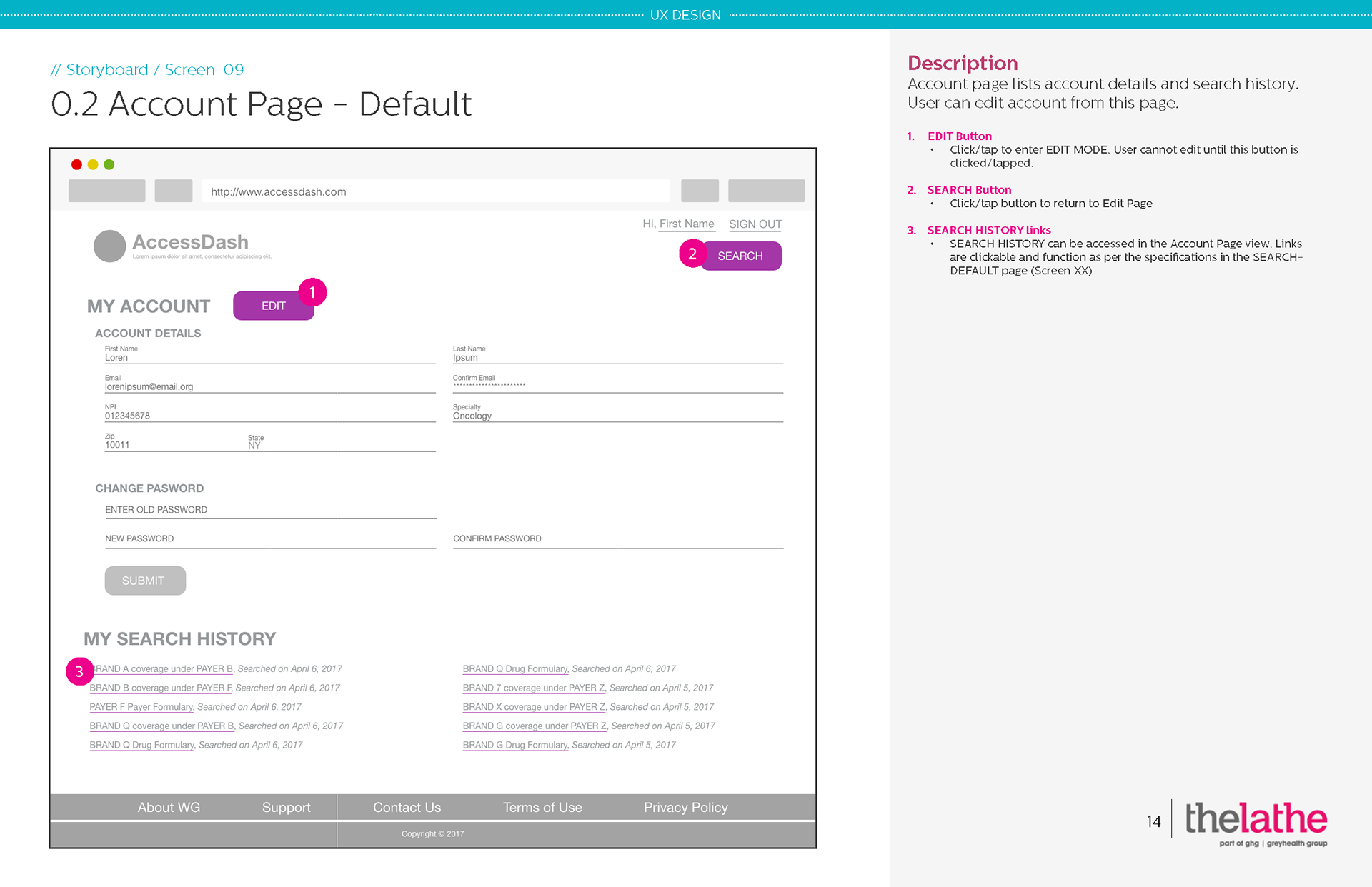
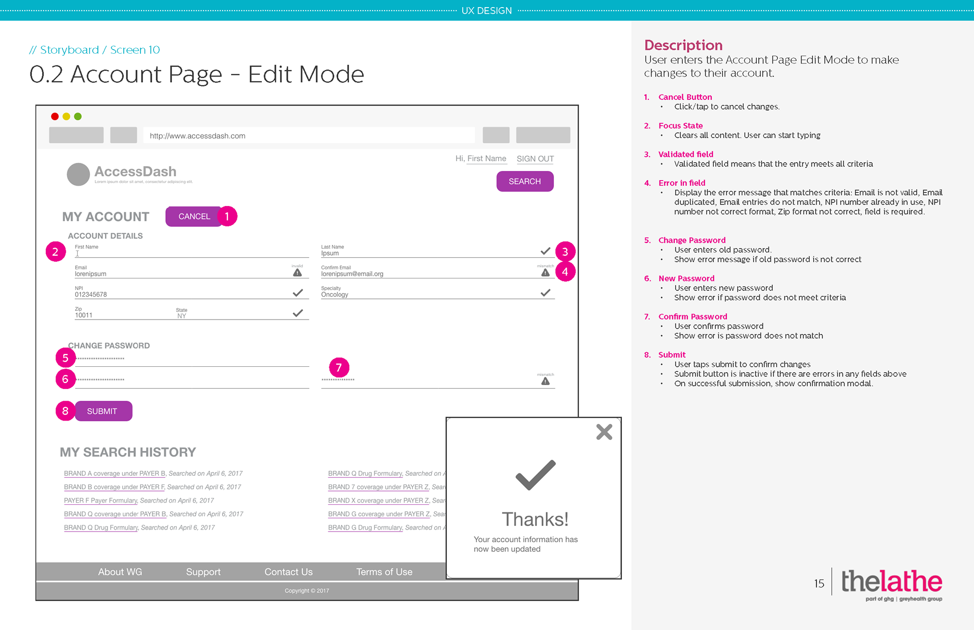
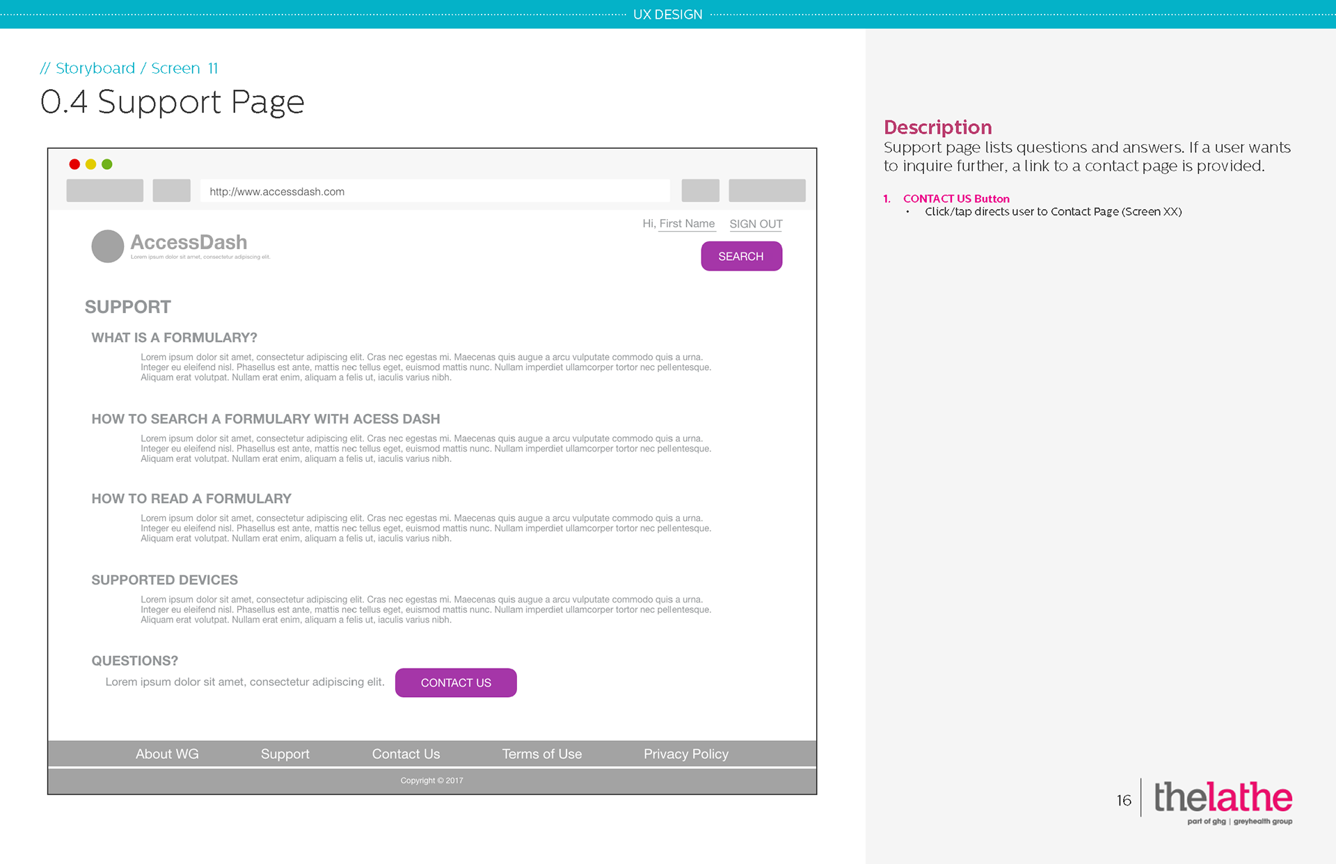
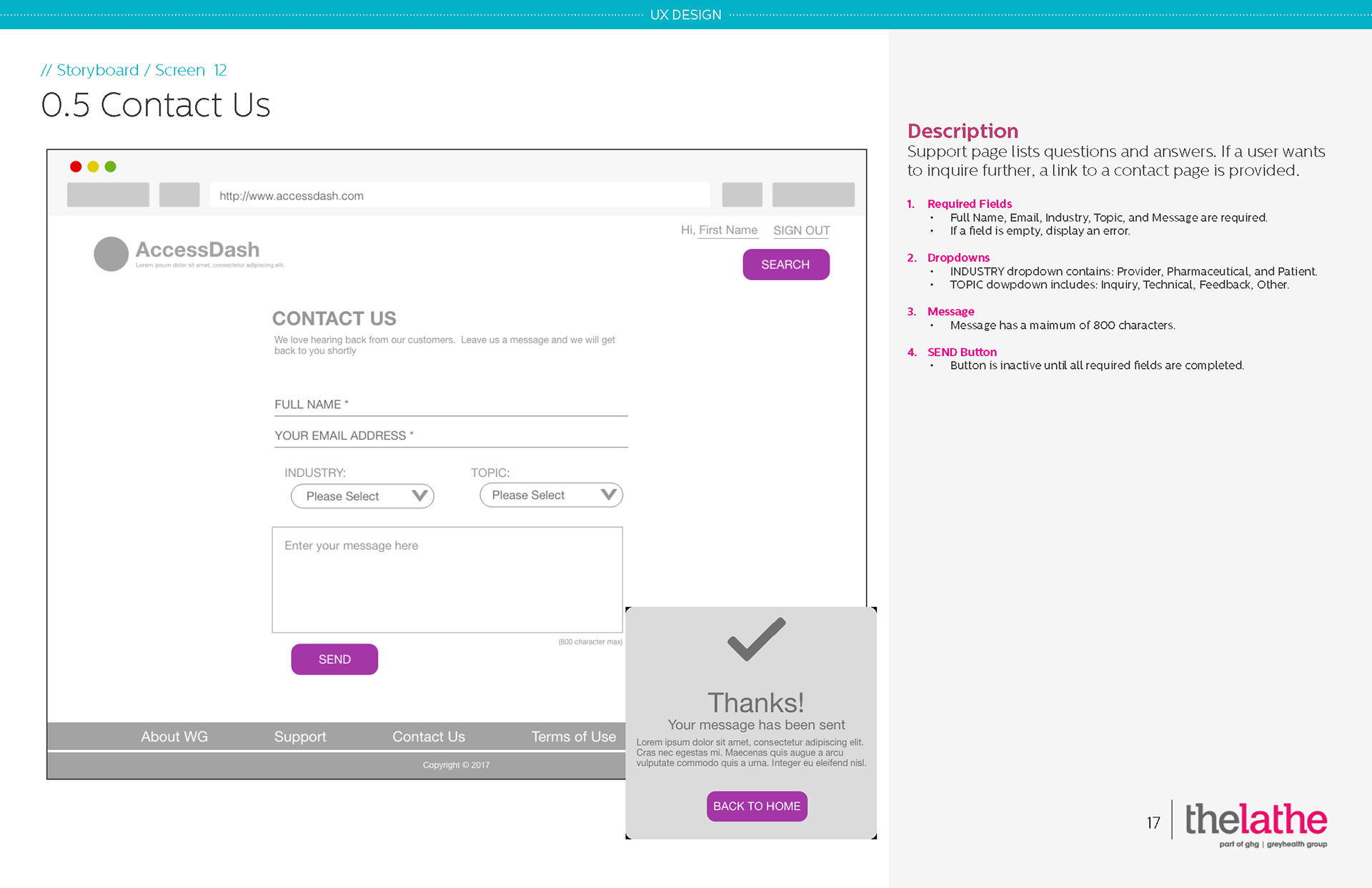
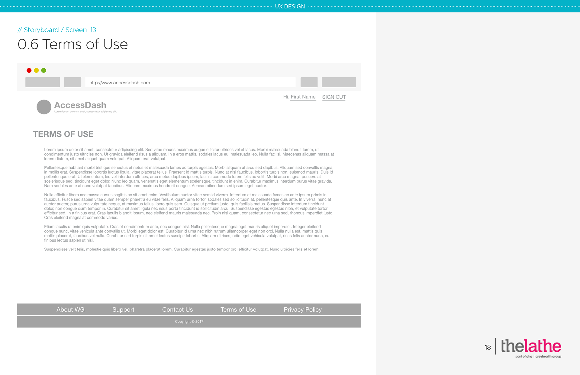
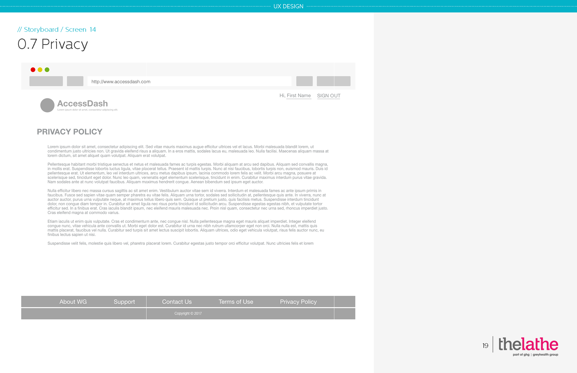
Displayed below are tablet views.
E. Visual Design Concepts
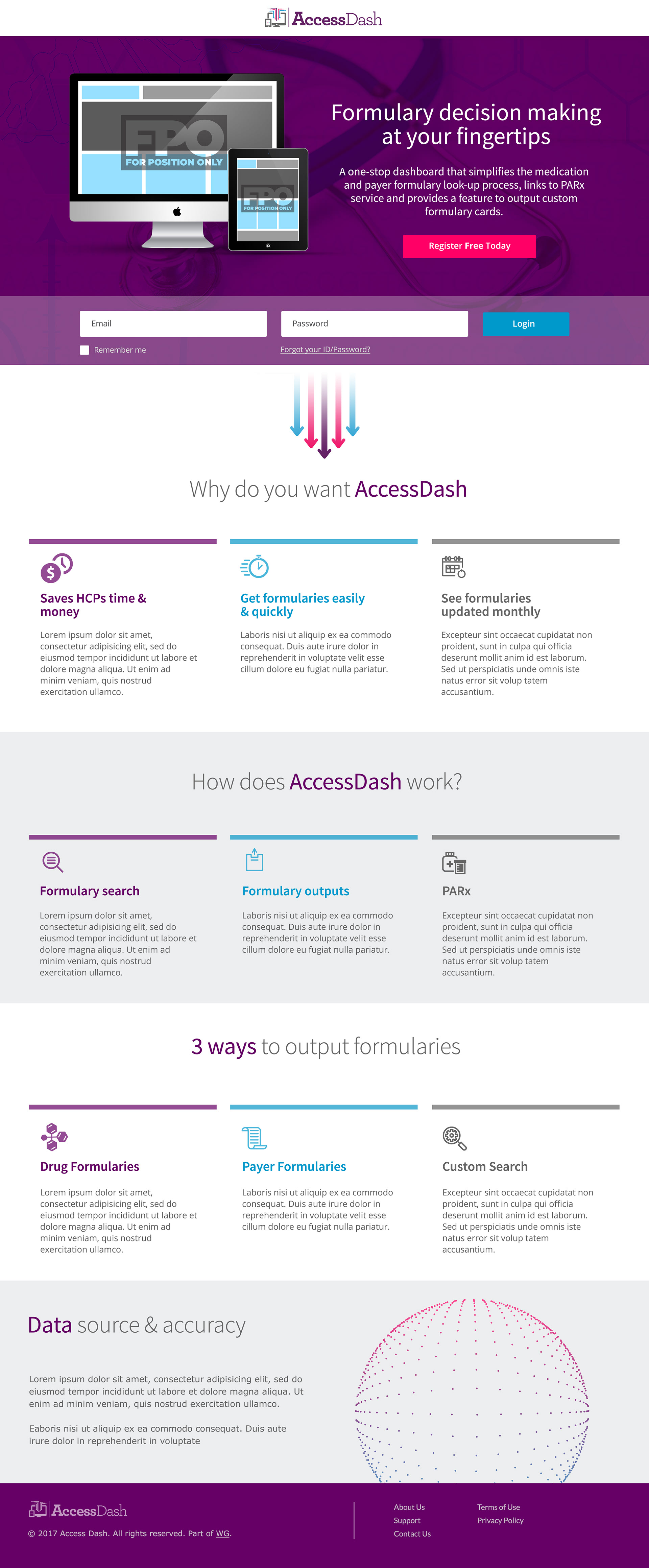
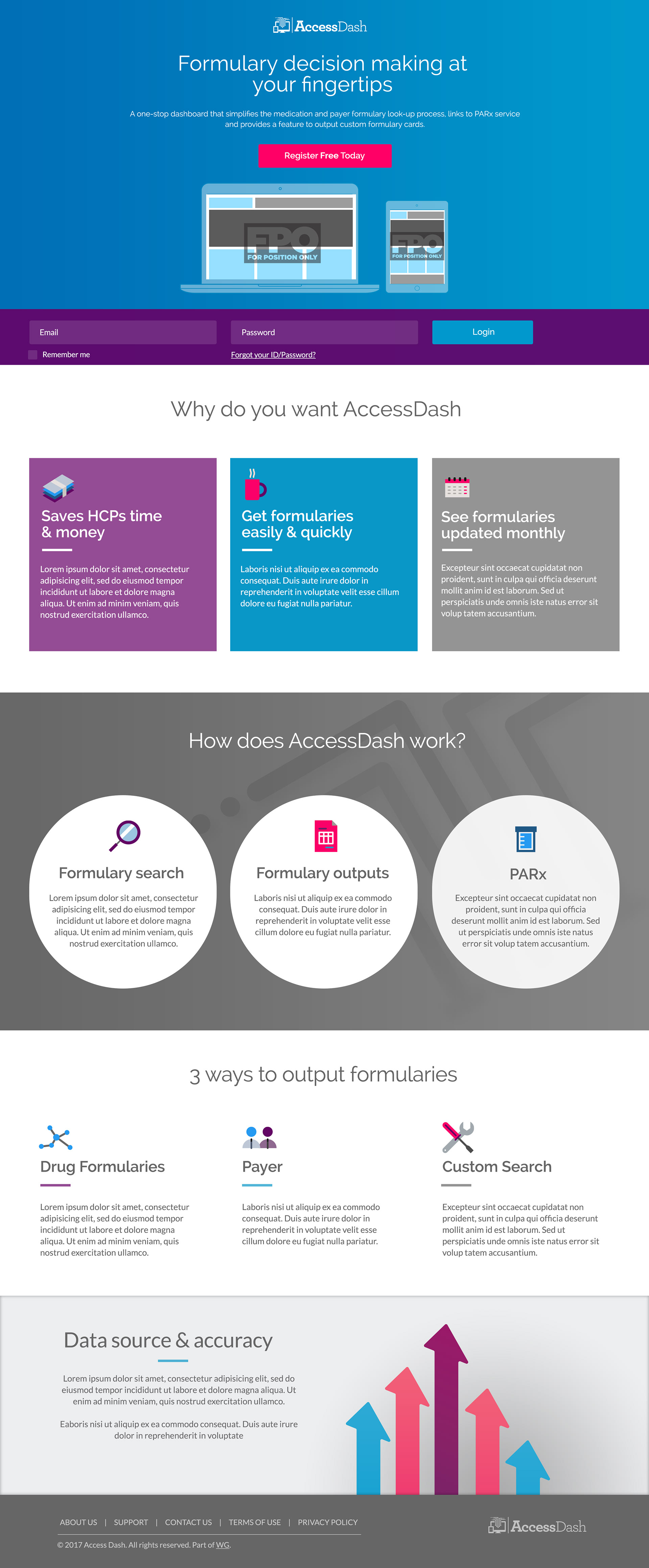
Using Creative Suite applications, my team designed 2 visual concept pages of the homepage and presented to the client.
IV. TAKEAWAYS
We had to initiate a product strategy workshop with the client because they had not identified the business goals or KPIs prior to contracting us. Our agency had not anticipated this in depth discovery phase.
While defining the features, we realized that the client had not solidified contracts with formulary data companies. Without knowing where the data would come from or what the limitations within each dataset would be, we couldn’t continue with the design and development of the application.