I. PROJECT OVERVIEW
Client:
Global Ecommerce Apparel Company
Team and Roles:
Account Management, Project Management, Engineering, Quality Assurance
User Experience Team – Director of UX (that was me!) and Senior UX Designer
Duration of Project
3 months
Problem Statement, Client Goal and Objective
The ecommerce client wanted to improve the management of retail locations through virtual means. Their existing system was decentralized and inefficient which resulted in further issues:
• Difficult for the client’s corporate and field managers to oversee overall progress of their retail locations on completing assigned tasks
• Lower compliance of retail locations on completing tasks assigned to them by the client’s corporate and field managers
• Unnecessary time and money wasted on back-and-forth communication between field managers and retail locations to ensure proper completion of assigned tasks
• Unnecessary time and money spent on travel for field managers to all of their store locations to ensure proper completion of assigned tasks
The client objective was to resolve or mitigate the issues defined above by creating:
• A task based system that is self-enforcing
• A centralized space for communication between corporate, field managers and retail locations
• An easier way for corporate employees and field managers to oversee the progress of retail locations on completing assigned tasks
Platforms
The client’s different users were familiar with 1 of the 3 different platforms for their everyday work tasks. The client requested that we create experiences based on their existing usage so that minimal time is required for onboarding. My team created three experiences from scratch using the platforms that pertained to each user type:
• SharePoint/Office 365 website for desktop computers – for VP employees and regional managers
• iOS for corporate iPhones – for corporate employees and district managers
• Android for TC-51 (Zebra scanner ) – for store associates
II. DISCOVERY (DEFINING THE PROBLEM)
A. Understanding the Problem
Who are the main users of the product?
The Virtual Sales Manager (VSM) app was created to help VP and corporate employees, field (regional and district) managers, and store associates streamline communications and to make sure that stores are complying with tasks assigned by corporate and/or regional managers.
This tool would allow corporate users and field managers to quantify how tasks are progressing and if stores are complying in a timely fashion.
The VSM app would allow corporate and regional manager users to add and edit tasks from their desktop computers or iPhones, while store associates use the Zebra scanner (Android operating system) to complete assigned tasks.
This project would be completed in phases. In this first stage a minimal viable product was created to satisfy the immediate needs of the users and client short deadline.
B. Understand the Users
To understand the users’ needs and goals, we mapped the users’ profile.
We used empathy maps to get at the heart of the users’ needs and motivations.
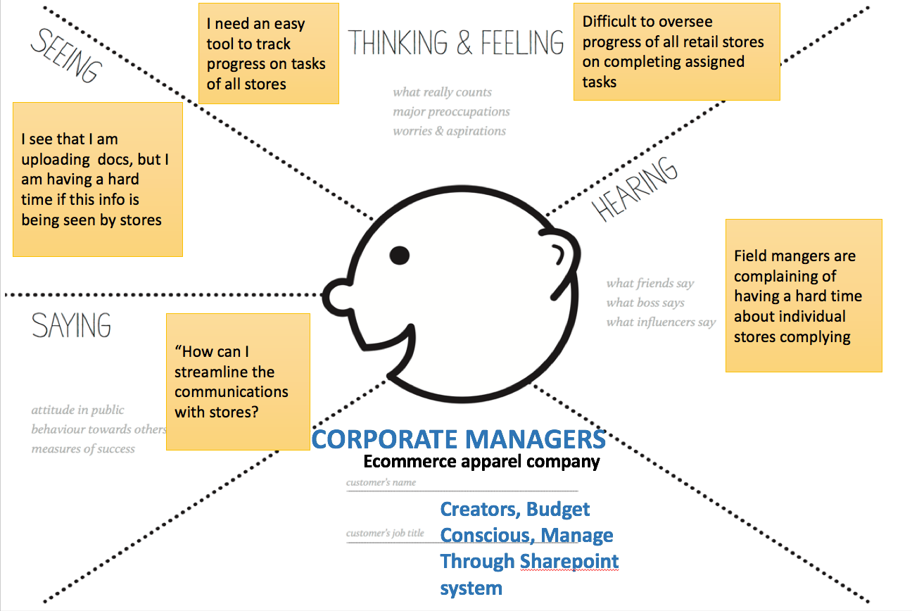
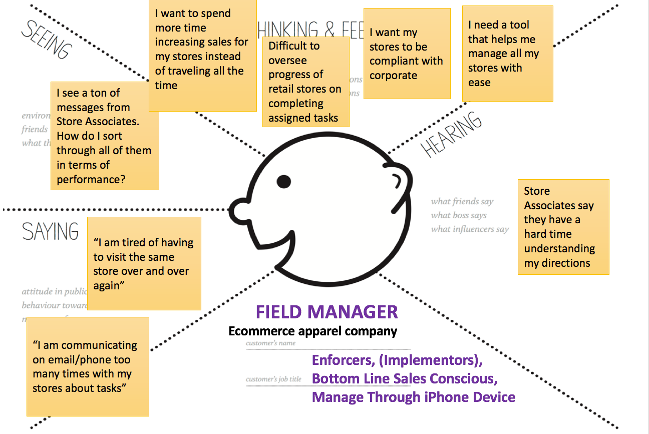
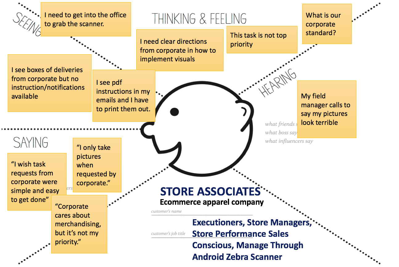
During this process, we derived user personas to guide thinking before creating feature sets. Later, the client decided to redefine the first 2 user types into VP/ Regional Managers and Corporate/ District Managers.
We identified some assumptions…
1. Field managers and store associates would mark a task’s status appropriately.
2. There is a reliable internet connection for all end-users of the application.
And constraints...
1. The format of the SAP export cannot change between versions of the exports without letting us know
2. This system can only reflect the latest SAP that has been exported and provided we implement into the system. To remove or modify stores and attributes we would need a new SAP export.
3. Store associates do not have access to the client’s Microsoft Office 365 network.
4. Corporate and field managers do not use Android systems for business.
5. SharePoint platform has limitations on mobile devices.
III. SOLUTIONS
A. User Journey
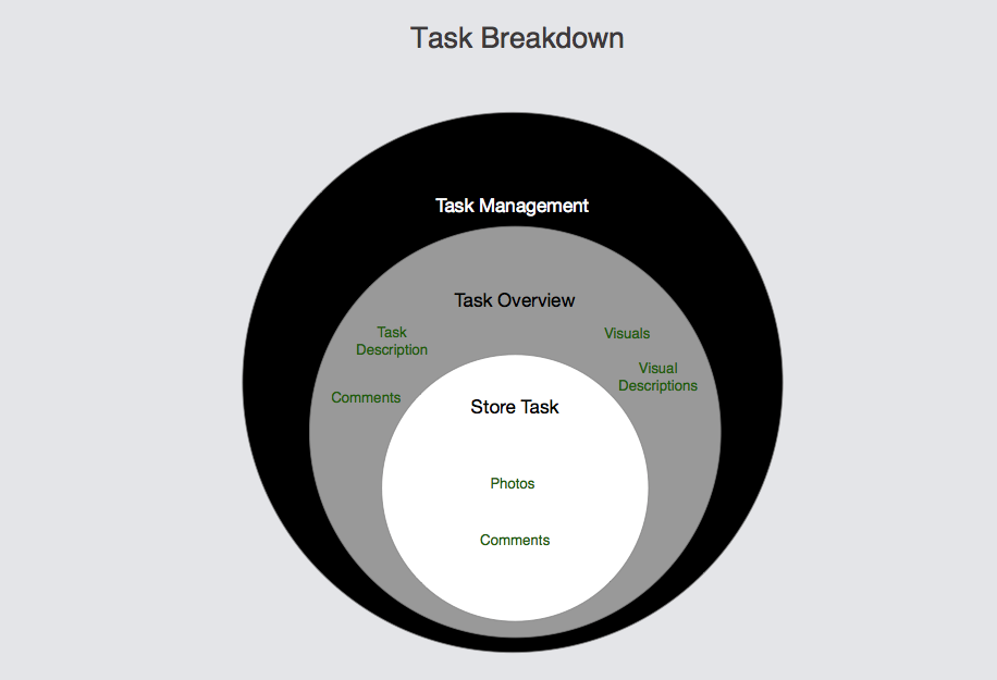
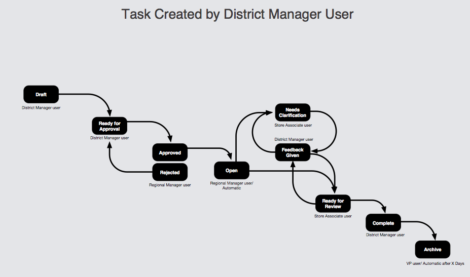
The product was centered around task creation, fulfillment and follow-up. We created a user journey for this specific function so we could identify how each user type relates to each other.

B. MVP Feature Sets
We narrowed down a minimum viable product for Phase 1.0 by identifying the features that can be executed in time of client’s requested deadline. For the purposes of this presentation, I will only show the corporate and store associate features.
Corporate Users’ features – via Sharepoint platform
Corporate Users’ features – via iOS iphone platform
Store Associate features – via Android platform
C. Information Architecture
We structured pages/screens based on the user's journeys and feature sets.
Then we digitalized the sitemap and added modals that were initially missing from our brainstorm. Displayed is only the desktop (corporate and district manager user permissions) sitemap for this presentation purpose.
D. User Flows
Displayed below are only a few user flows because this system is very complicated and involves 3 different users and platforms. If I included all of the user flows, you would scroll for days.
E. Concept Exploration
We created whiteboard concepts to work through several user scenarios and explore possible pain points before formally drafting wireframes. The examples below show the corporate/ district manager users’ journey and how they can fulfill task requirements on homepage and task management overview page.
F. Wireframes
We made several adjustments after many discussions and brainstorming sessions with the team. The examples below show the digitized wireframes, created in OmniGraffle, for the corporate/ district manager’s homepage and task management overview page. We made adjustments to the widgets, inbox, menu and task statuses.
G. Visual Design Considerations
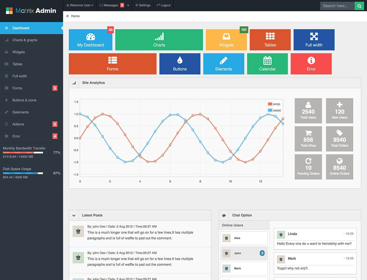
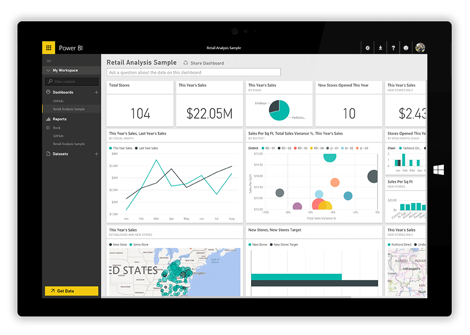
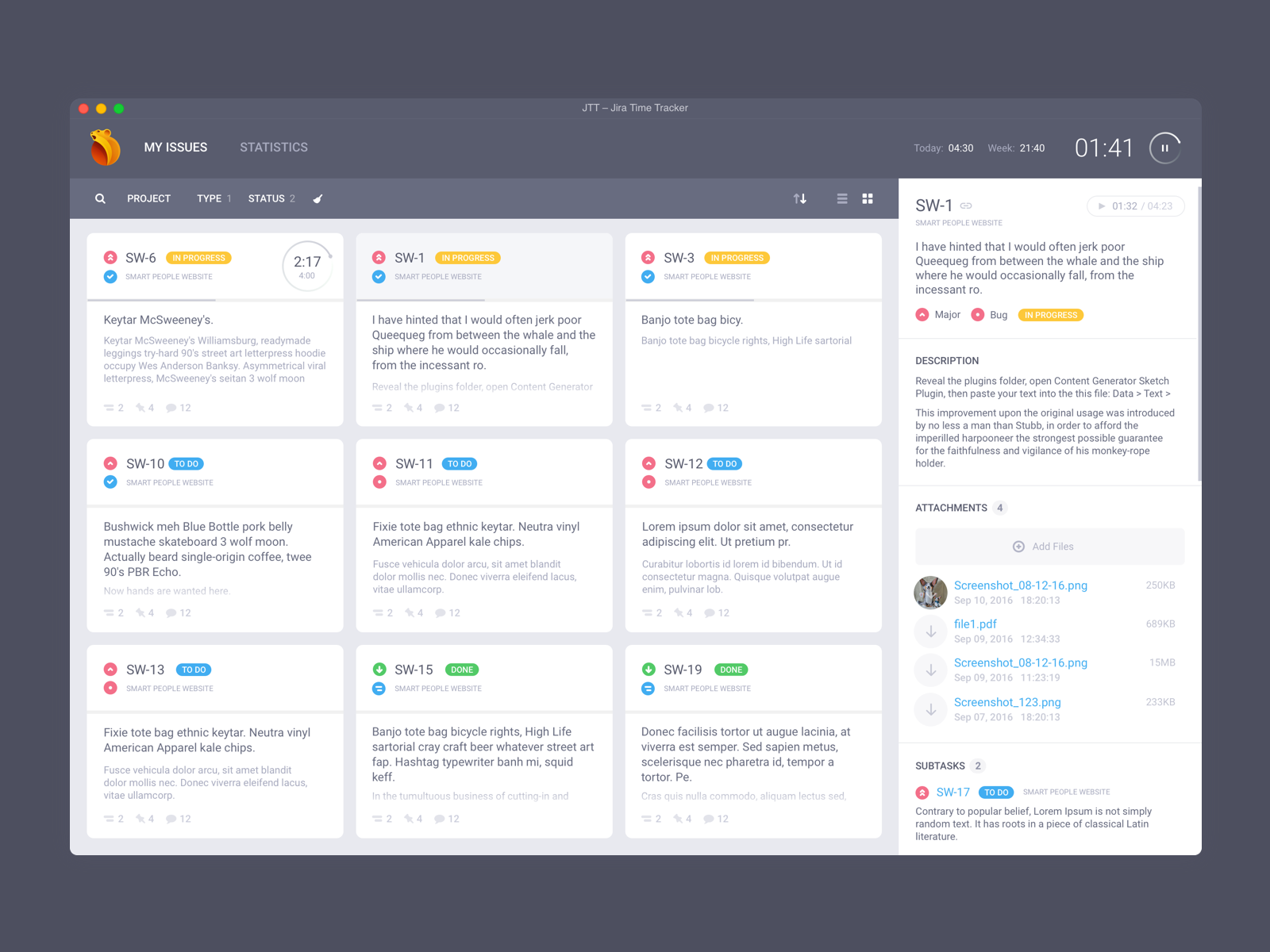
We used several sources for inspiration of the homepage page.
IV. TAKEAWAYS
Challenges
The UX team was onboarded onto the project after the head of engineering and project manager presented a business requirements document. We were expected to design 3 platforms for 3 different users without any insight into the users behaviors and needs. We were expected to design these applications based on assumptions within a tight turnaround time. This caused many issues such as wasted time by many back and forth presentations with the client.
After the first round of wireframes were submitted, the client requested we design the mobile applications similar to two existing company-wide applications with the intent to ease onboarding for the employees.
Initially the client requested we design 3 different applications based on each users’ usage. For example, VPs and regional managers use SharePoint on their desktops; whereas, Store Associates use an Android device. Later, we found it to be more effective to create a SharePoint and iOS app version for VPs, corporate and all field managers while customizing permissions of specific features for each user type.
Outcomes
I left the company before my team was able to prototype these applications.